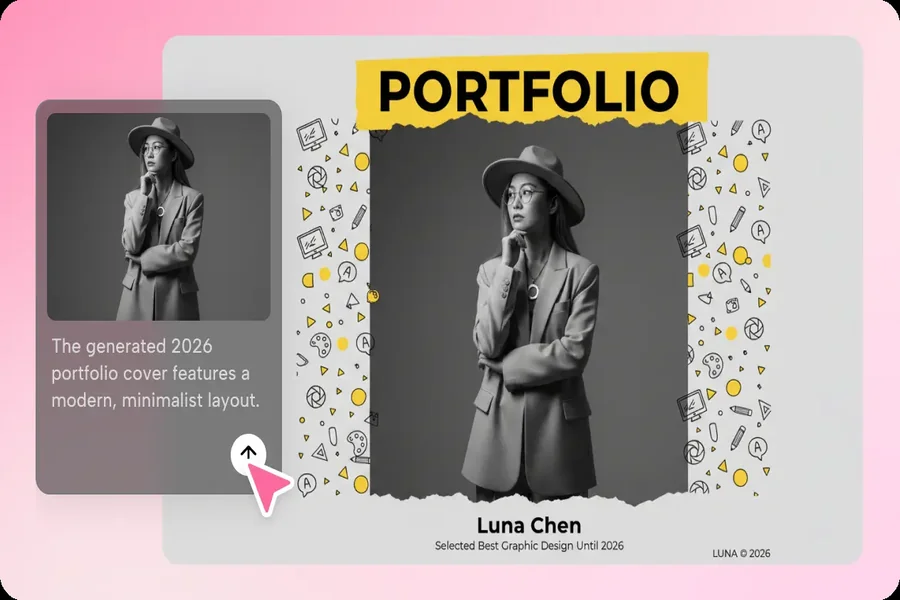
A portfolio full of talent but visually scattered pieces can quietly undercut its own impact — a viewer scrolling through mismatched colors, inconsistent framing, and competing styles has to work harder to see the thread connecting the work, and many simply won’t bother.
The strongest portfolios feel like they belong to one coherent voice, even across very different projects. You can generate images with AI to build that kind of cohesive presentation, and Dreamina is particularly effective at producing a consistent visual system that ties an entire portfolio together.
Why a scattered portfolio undersells genuinely strong work
Viewers, whether clients or hiring managers, often judge a portfolio’s overall professionalism within seconds, based largely on visual consistency rather than individual piece quality. Even excellent work can read as less polished if it’s presented inconsistently, while a cohesive system makes every piece look stronger by association.
Auditing your existing work for a natural unifying thread
Before designing new presentation graphics, look across your existing portfolio pieces for a thread that’s already present, even if unintentional — a recurring color, a consistent mood, a shared subject matter. This existing thread often provides the most authentic foundation for a unified system.
- A recurring color or tone across your strongest pieces
- A consistent subject matter or thematic focus
- A shared mood, whether minimal, bold, or warm
Designing consistent framing and presentation for every piece
Beyond the work itself, how each piece is presented matters enormously. Consistent backdrop style, lighting, and framing across every portfolio image creates a sense of intentional curation, even when the underlying projects vary significantly.
Build your portfolio visuals in three moves
Dreamina makes producing a consistent presentation system fast enough to apply across an entire body of work.
Step 1: Write a text prompt
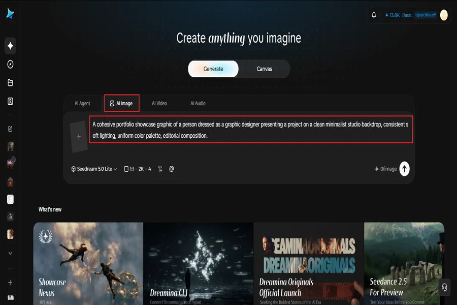
Go to Dreamina and describe your desired presentation style in detail, including backdrop, lighting, and overall mood. Upload a reference image of your actual work to guide how it should be showcased.
Example: A cohesive portfolio showcase graphic of a person dressed as a graphic designer presenting a project on a clean minimalist studio backdrop, consistent soft lighting, uniform color palette, editorial composition.
Step 2: Adjust parameters and generate
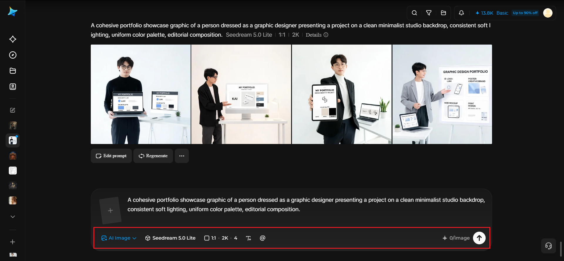
Select Image 5.0 Pro, powered by Seedream 5.0 Pro, for consistent lighting and color rendering across your entire portfolio set, then set your aspect ratio, canvas size, and resolution — 1K for web previews, 2K for a polished printed portfolio book. Click the generate icon to render each piece.
Step 3: Customize and download
Refine each piece using Dreamina’s tools: inpaint to adjust specific presentation details, expand to reframe for different layout needs, remove to clean up any inconsistencies, and retouch for a final matching finish across the set. Once each piece is ready, click Download.
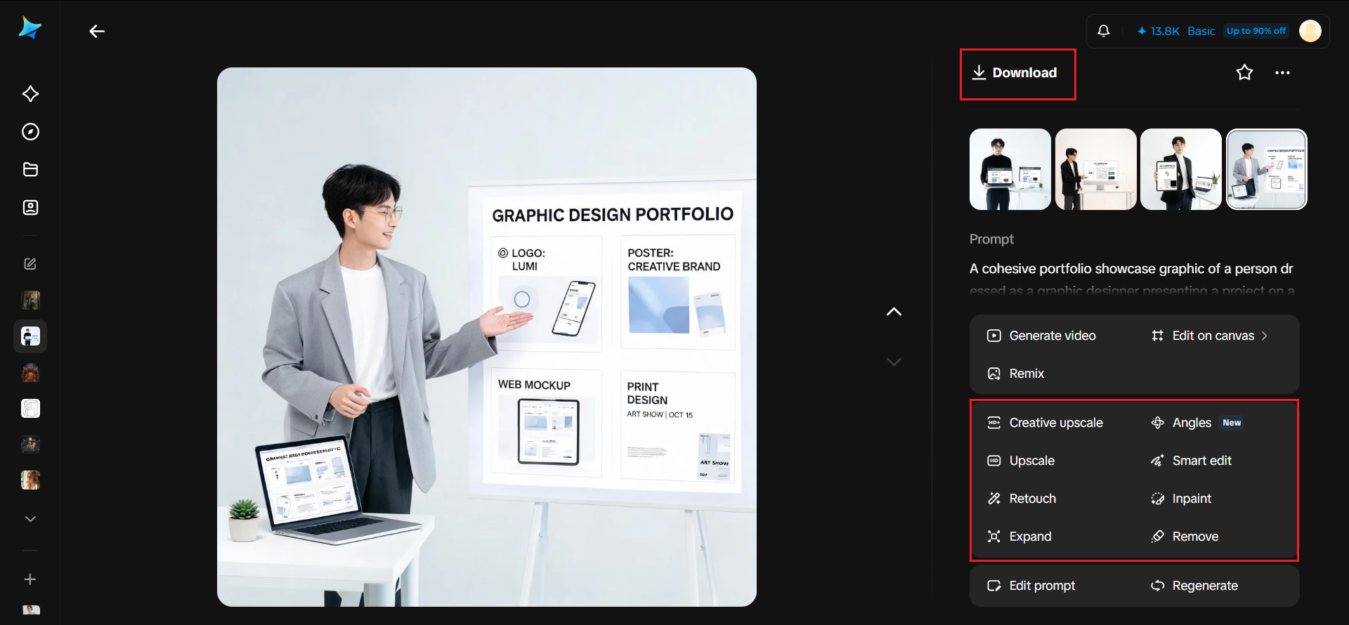
Dreamina and its image generation models
Dreamina’s image generation runs on Seedream 5.0 Pro, the newest and most capable model available, and its strengths are especially well suited to portfolio consistency work. Its precise editing lets you adjust one presentation detail, like a backdrop color or lighting angle, across a growing set of portfolio images without disturbing the overall system you’ve already established.
Its layer-based control treats each presentation graphic as addressable parts, making it simpler to update individual elements as your portfolio grows over time, while keeping everything feeling like part of the same cohesive collection.
Nano Banana offers quicker generation for testing a presentation style before applying it across your full body of work, while GPT Image 2 handles prompts describing specific layout requirements closely, useful for more structured portfolio grid presentations.
Choosing a color palette that represents your personal brand
Your portfolio’s color system should feel like an extension of your personal or professional brand, not an arbitrary aesthetic choice. Selecting one or two signature colors and applying them consistently across every presentation graphic reinforces recognition as viewers move through your work.
Organizing your portfolio around a clear visual hierarchy
Beyond color and framing, consider which pieces deserve the most prominent placement and largest presentation. A clear hierarchy, with your strongest work given the most visual weight, guides viewers toward what you most want them to notice first.
Adapting your visual system across different portfolio formats
A strong presentation system should translate across a website, a PDF leave-behind, and social media previews. Generating variations that maintain the same core visual language across these different formats keeps your professional presence consistent everywhere it appears.

Where a cohesive portfolio system makes the biggest difference
A unified visual presentation pays off clearly in several high-stakes contexts:
- Client pitch meetings and freelance proposals
- Job applications and creative hiring processes
- Personal websites and online portfolio platforms
- Printed leave-behinds for in-person presentations
Let your work speak with one consistent voice
Even genuinely excellent individual pieces benefit from being presented as part of something cohesive. With Dreamina and the consistency-focused precision of Seedream 5.0 Pro, building that unified portfolio system takes far less time than it sounds, and it’s free to start designing today.